DhButton
Action button family split by role — DhPrimaryButton / DhSecondaryButton / DhTertiaryButton / DhErrorButton — with filled / tonal / outlined / text surfaces, three sizes, two shapes, icon slots, and built-in loading + disabled states.
Basic
Reach for the role that matches the action. Primary is the highest-emphasis filled button.
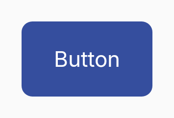
DhPrimaryButton(
    text = "Save",
    onClick = { save() }
)
Roles
Four role composables; each picks its own colour from the Material 3 colour scheme.
// Pick the composable that matches the action's role.
DhPrimaryButton(text = "Save", onClick = { save() })
DhSecondaryButton(text = "Cancel", onClick = { cancel() })
DhTertiaryButton(text = "Highlight", onClick = { promote() })
DhErrorButton(text = "Delete", onClick = { delete() })
Surface
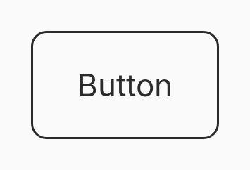
Every role accepts a surface override. Defaults are Filled (Primary, Tertiary, Error) and Outlined (Secondary).
// Override the per-role default surface to lower the emphasis.
DhPrimaryButton(
    text = "Save",
    onClick = { save() },
    surface = DhButton.Surface.Outlined,
)

// Ghost / text-button equivalent.
DhSecondaryButton(
    text = "Skip",
    onClick = { skip() },
    surface = DhButton.Surface.Text,
)
Ghost (Secondary + Text)
Pair DhSecondaryButton with the Text surface for a transparent, label-only affordance — the KMP equivalent of Svelte's ghost variant.
DhSecondaryButton(
    text = "Skip",
    onClick = { skip() },
    surface = DhButton.Surface.Text,
)
Sizes
Small (44 dp), Medium (56 dp), Large (64 dp).
DhPrimaryButton(text = "Compact", onClick = {}, size = DhButton.Size.Small)
DhPrimaryButton(text = "Default", onClick = {})
DhPrimaryButton(text = "Prominent", onClick = {}, size = DhButton.Size.Large)
Shape
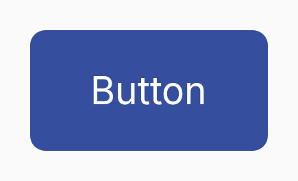
Square (8 dp corners) is the default; Round renders a pill.
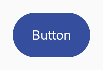
DhPrimaryButton(
    text = "Pill",
    onClick = {},
    shape = DhButton.Shape.Round,
)
Icons
Pass a composable for the leading or trailing slot — the button enforces a consistent icon size per geometry tier.
DhPrimaryButton(
text = "Add",
onClick = { add() },
startIcon = { Icon(painterResource(Res.drawable.ic_add), null) },
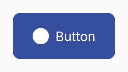
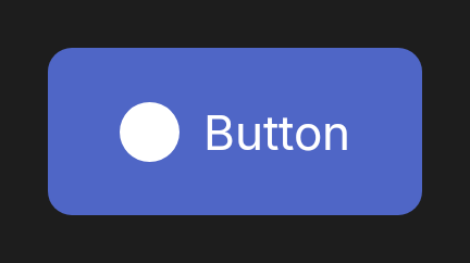
)Loading
Replaces the leading icon with a spinner, hides the trailing icon, and blocks clicks. Announces progress via Compose semantics.
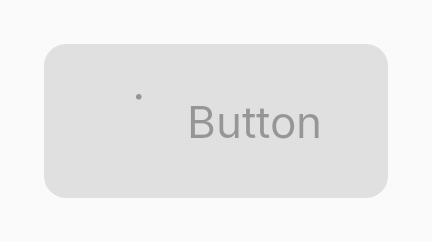
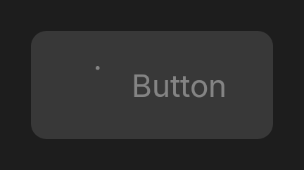
DhPrimaryButton(
    text = "Submit",
    onClick = { submit() },
    loading = isSubmitting,
)