DhIconButton
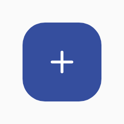
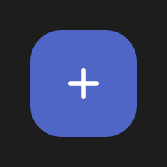
Square, icon-only button — the icon-driven sibling of DhButton. Shares the role colour system, surfaces (Filled / Outlined / Text), the M3 Expressive size scale, and the pressed corner morph, but renders a single centred icon in an equal-aspect container. Colour role is the variant parameter. Use for compact actions like a +/− stepper.
Stepper (+ / −)
A pair of icon buttons for incrementing and decrementing a value.
Row(verticalAlignment = Alignment.CenterVertically) {
    DhIconButton(
        icon = { DhIcon(DhIcons.Minus, contentDescription = null, decorative = true) },
        contentDescription = "Decrease",
        onClick = { count-- },
        surface = DhButton.Surface.Outlined,
    )
    Text("$count")
    DhIconButton(
        icon = { DhIcon(DhIcons.Plus, contentDescription = null, decorative = true) },
        contentDescription = "Increase",
        onClick = { count++ },
    )
}
Surfaces
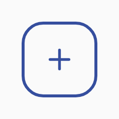
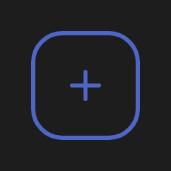
Filled, Outlined, and Text — the same surface treatments as DhButton.
DhIconButton(icon = { DhIcon(DhIcons.Plus, null, decorative = true) }, contentDescription = "Add", onClick = {})
DhIconButton(icon = { DhIcon(DhIcons.Plus, null, decorative = true) }, contentDescription = "Add", onClick = {}, surface = DhButton.Surface.Outlined)
DhIconButton(icon = { DhIcon(DhIcons.Plus, null, decorative = true) }, contentDescription = "Add", onClick = {}, surface = DhButton.Surface.Text)
Text surface
Lowest emphasis — transparent container with a role-coloured icon.

DhIconButton(icon = { DhIcon(DhIcons.Plus, null, decorative = true) }, contentDescription = "Add", onClick = {})
DhIconButton(icon = { DhIcon(DhIcons.Plus, null, decorative = true) }, contentDescription = "Add", onClick = {}, surface = DhButton.Surface.Outlined)
DhIconButton(icon = { DhIcon(DhIcons.Plus, null, decorative = true) }, contentDescription = "Add", onClick = {}, surface = DhButton.Surface.Text)
Round
A full circle instead of the size-scaled rounded square.


DhIconButton(
    icon = { DhIcon(DhIcons.Plus, contentDescription = null, decorative = true) },
    contentDescription = "Add",
    onClick = {},
    shape = DhButton.Shape.Round,
)
Variants
Primary / Secondary / Tertiary / Error colour roles.
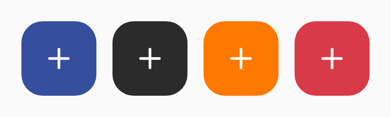
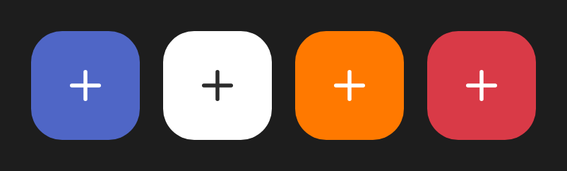
// Colour role via the variant parameter.
DhIconButton(icon = { DhIcon(DhIcons.Plus, null, decorative = true) }, contentDescription = "Add", onClick = {}, variant = DhIconButton.Variant.Primary)
DhIconButton(icon = { DhIcon(DhIcons.Plus, null, decorative = true) }, contentDescription = "Add", onClick = {}, variant = DhIconButton.Variant.Secondary)
DhIconButton(icon = { DhIcon(DhIcons.Plus, null, decorative = true) }, contentDescription = "Add", onClick = {}, variant = DhIconButton.Variant.Tertiary)
DhIconButton(icon = { DhIcon(DhIcons.Trash, null, decorative = true) }, contentDescription = "Delete", onClick = {}, variant = DhIconButton.Variant.Error)
Sizes
The M3 Expressive size scale — the button stays square at each tier’s height.
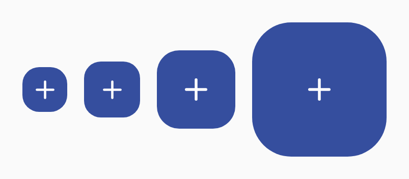
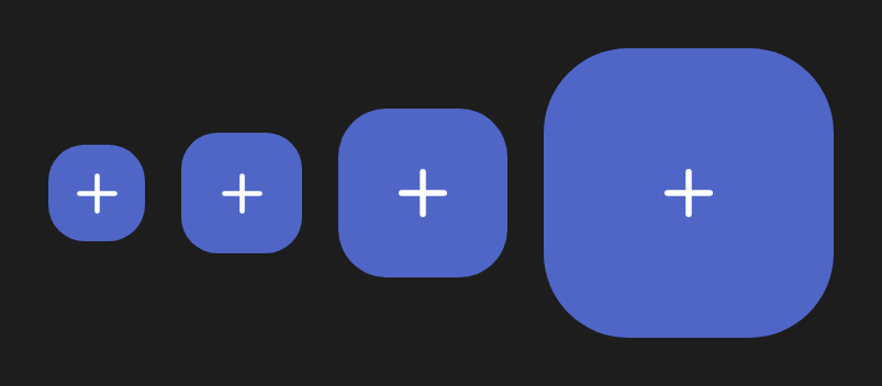
DhIconButton(icon = { DhIcon(DhIcons.Plus, null, decorative = true) }, contentDescription = "Add", onClick = {}, size = DhButton.Size.XSmall)
DhIconButton(icon = { DhIcon(DhIcons.Plus, null, decorative = true) }, contentDescription = "Add", onClick = {}, size = DhButton.Size.Small)
DhIconButton(icon = { DhIcon(DhIcons.Plus, null, decorative = true) }, contentDescription = "Add", onClick = {}, size = DhButton.Size.Medium)
DhIconButton(icon = { DhIcon(DhIcons.Plus, null, decorative = true) }, contentDescription = "Add", onClick = {}, size = DhButton.Size.Large)