DhTabs
Underline-indicator tab strip for switching between sibling views. Variant (primary/secondary/tertiary/error) × alignment (start/center/end/stretch) × scrollable. Renders only the strip — caller owns selectedIndex and the content below.
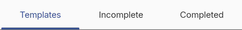
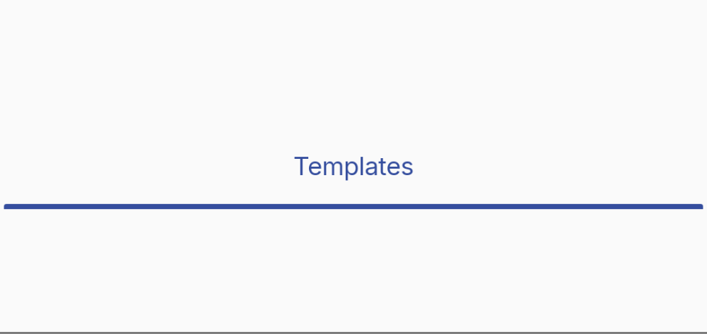
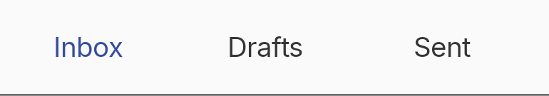
Basic — primary variant, stretch alignment
The defaults: variant=Primary draws the active label and 3.dp pill indicator in --color-primary; alignment=Stretch gives each tab equal width.

var current by remember { mutableStateOf(0) }

DhTabs(
    selectedIndex = current,
    onTabSelected = { current = it },
    tabs = listOf(
        DhTabs.Item("Templates"),
        DhTabs.Item("Incomplete"),
        DhTabs.Item("Completed")
    )
)
Variant — secondary
Selected text and indicator pick up --color-secondary.

DhTabs(
selectedIndex = current,
onTabSelected = { current = it },
tabs = items,
variant = DhTabs.Variant.Secondary
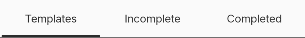
)Variant — tertiary
Selected text and indicator pick up --color-tertiary.


DhTabs(
selectedIndex = current,
onTabSelected = { current = it },
tabs = items,
variant = DhTabs.Variant.Tertiary
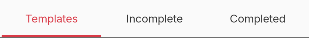
)Variant — error
Selected text and indicator pick up --color-error. Use for destructive-flow tabs (e.g. failed-items panes).

DhTabs(
selectedIndex = current,
onTabSelected = { current = it },
tabs = items,
variant = DhTabs.Variant.Error
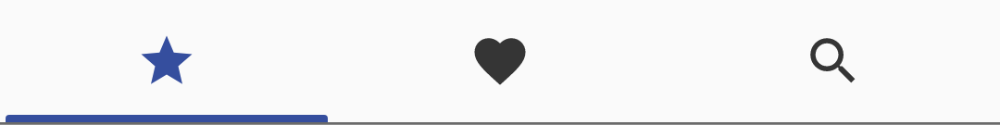
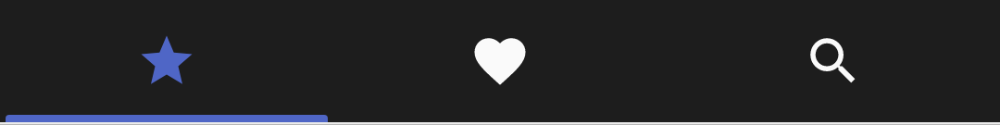
)Icon-only configuration
Pass only the icon slot on each Item. Provide contentDescription for screen readers. Paparazzi can't resolve Compose Multiplatform `Res.drawable.*` headlessly, so the snapshot uses Material `ImageVector` icons; in your code use the Davidhorn icon set.
DhTabs(
    selectedIndex = current,
    onTabSelected = { current = it },
    tabs = listOf(
        DhTabs.Item(icon = { Icon(painterResource(Res.drawable.ic_camera), null) }, contentDescription = "Video"),
        DhTabs.Item(icon = { Icon(painterResource(Res.drawable.ic_image), null) }, contentDescription = "Photos"),
        DhTabs.Item(icon = { Icon(painterResource(Res.drawable.ic_microphone_on), null) }, contentDescription = "Audio")
    )
)
Label + icon configuration
Pass both label and icon on each Item — the tab stacks them vertically at a 64.dp min-height (Figma label-icon row spec).
DhTabs(
    selectedIndex = current,
    onTabSelected = { current = it },
    tabs = listOf(
        DhTabs.Item("Video", icon = { Icon(painterResource(Res.drawable.ic_camera), null) }),
        DhTabs.Item("Photos", icon = { Icon(painterResource(Res.drawable.ic_image), null) }),
        DhTabs.Item("Audio", icon = { Icon(painterResource(Res.drawable.ic_microphone_on), null) })
    )
)
Alignment — start
Tabs use their intrinsic width and the strip hugs the leading edge of the container.


DhTabs(
    selectedIndex = current,
    onTabSelected = { current = it },
    tabs = items,
    alignment = DhTabs.Alignment.Start
)
Alignment — center
Tabs use their intrinsic width and the strip centres within the container.

DhTabs(
    selectedIndex = current,
    onTabSelected = { current = it },
    tabs = items,
    alignment = DhTabs.Alignment.Center
)
Alignment — end
Tabs use their intrinsic width and the strip hugs the trailing edge.


DhTabs(
    selectedIndex = current,
    onTabSelected = { current = it },
    tabs = items,
    alignment = DhTabs.Alignment.End
)
Scrollable overflow
When the strip is wider than its container, alignment ≠ Stretch + scrollable=true gives a 90.dp-min horizontal scroller.

DhTabs(
selectedIndex = current,
onTabSelected = { current = it },
tabs = manyTabs,
alignment = DhTabs.Alignment.Start,
scrollable = true
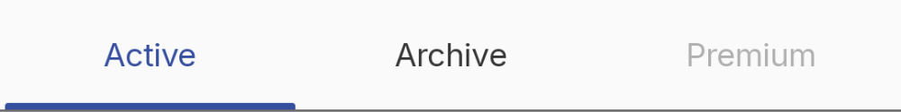
)Disabled tab
Tabs gated behind a permission or feature flag.

DhTabs(
    selectedIndex = current,
    onTabSelected = { current = it },
    tabs = listOf(
        DhTabs.Item("Active"),
        DhTabs.Item("Archive"),
        DhTabs.Item("Premium", enabled = false)
    )
)