DhTextField
Single-line or multi-line text input. Outlined / Filled variants, password mode, error + supporting text, leading / trailing icons.
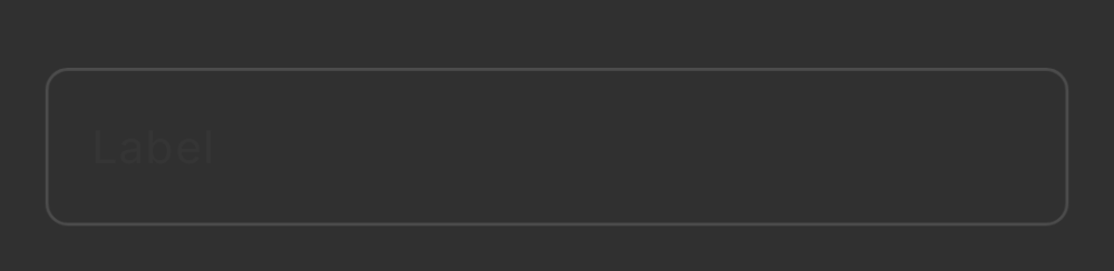
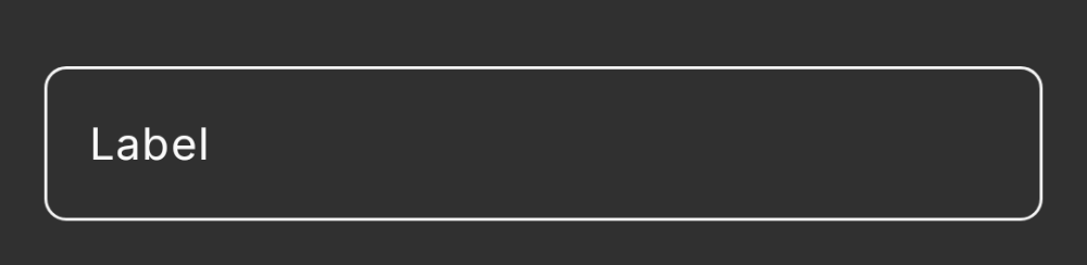
Basic
Outlined variant by default. Caller hoists value state.
var name by remember { mutableStateOf("") }
DhTextField(
value = name,
onValueChange = { name = it },
label = "Name"
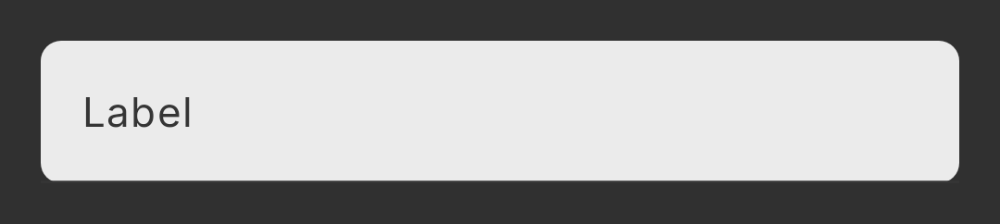
)Filled variant
Lower visual weight; embeds inside cards or settings rows.
DhTextField(
    value = note,
    onValueChange = { note = it },
    label = "Note",
    variant = DhTextField.Variant.Filled
)
Validation
isError colors the border, label, and supporting text.
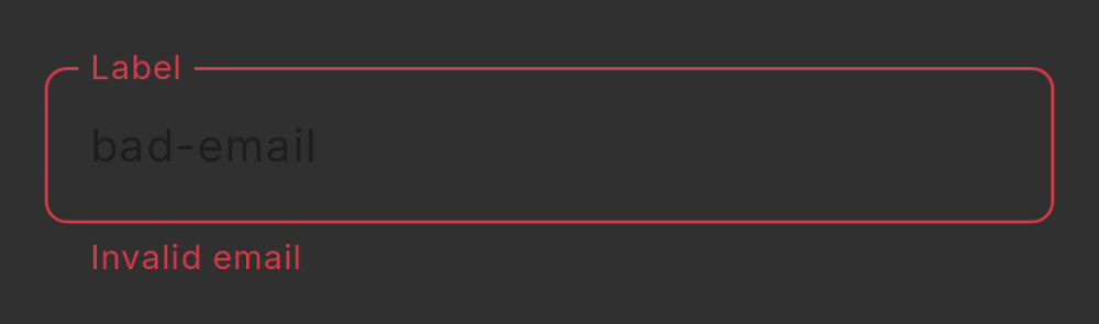
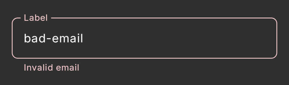
DhTextField(
    value = email,
    onValueChange = { email = it },
    label = "Email",
    isError = !isValidEmail(email),
    supportingText = if (!isValidEmail(email)) "Invalid email" else null,
    keyboardOptions = KeyboardOptions(keyboardType = KeyboardType.Email)
)
Password
Masks input and adds a visibility toggle. Snapshot omitted — the toggle icon is loaded from a Compose Multiplatform resource that Paparazzi can't render headlessly.
DhTextField(
    value = password,
    onValueChange = { password = it },
    label = "Password",
    isPassword = true
)
Multi-line
singleLine = false plus minLines / maxLines.
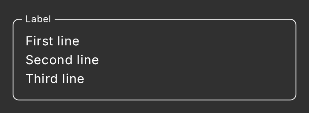
DhTextField(
    value = description,
    onValueChange = { description = it },
    label = "Description",
    singleLine = false,
    minLines = 3,
    maxLines = 6
)