DhPillTabs
Segmented pill chip group for switching between sibling views. Same selectedIndex / variant / alignment contract as DhTabs; selected chip is variant-filled, unselected chips show a surfaceBright border on the page surface.
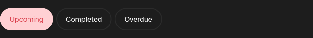
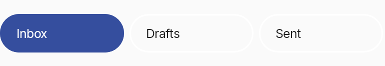
Basic — primary variant, start alignment
The defaults: variant=Primary fills the selected chip with --color-primary; alignment=Start keeps the chips hugging the leading edge.


var current by remember { mutableStateOf(0) }
DhPillTabs(
selectedIndex = current,
onTabSelected = { current = it },
tabs = listOf(
DhTabs.Item("Upcoming"),
DhTabs.Item("Completed"),
DhTabs.Item("Overdue")
)
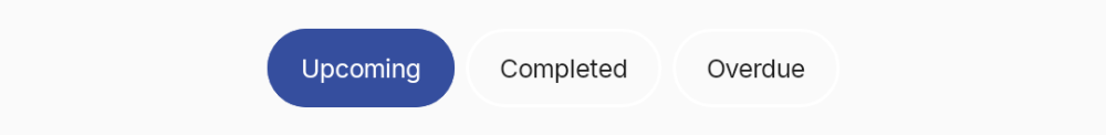
)Variant — secondary
Selected chip fills with --color-secondary.


DhPillTabs(
    selectedIndex = current,
    onTabSelected = { current = it },
    tabs = items,
    variant = DhTabs.Variant.Secondary
)
Variant — tertiary
Selected chip fills with --color-tertiary.


DhPillTabs(
    selectedIndex = current,
    onTabSelected = { current = it },
    tabs = items,
    variant = DhTabs.Variant.Tertiary
)
Variant — error
Selected chip fills with --color-error. Useful for highlighting destructive-flow filters.

DhPillTabs(
    selectedIndex = current,
    onTabSelected = { current = it },
    tabs = items,
    variant = DhTabs.Variant.Error
)
Icon-only configuration
Pass only the icon slot on each Item. Paparazzi can't resolve Compose Multiplatform `Res.drawable.*` headlessly, so the snapshot uses Material `ImageVector` icons; in your code use the Davidhorn icon set.
DhPillTabs(
    selectedIndex = current,
    onTabSelected = { current = it },
    tabs = listOf(
        DhTabs.Item(icon = { Icon(painterResource(Res.drawable.ic_star), null) }, contentDescription = "Highlights"),
        DhTabs.Item(icon = { Icon(painterResource(Res.drawable.ic_heart), null) }, contentDescription = "Favourites"),
        DhTabs.Item(icon = { Icon(painterResource(Res.drawable.ic_search), null) }, contentDescription = "Browse")
    )
)
Label + icon configuration
Pass both label and icon on each Item; the chip lays them out inline.
DhPillTabs(
selectedIndex = current,
onTabSelected = { current = it },
tabs = listOf(
DhTabs.Item("Highlights", icon = { Icon(painterResource(Res.drawable.ic_star), null) }),
DhTabs.Item("Favourites", icon = { Icon(painterResource(Res.drawable.ic_heart), null) }),
DhTabs.Item("Browse", icon = { Icon(painterResource(Res.drawable.ic_search), null) })
)
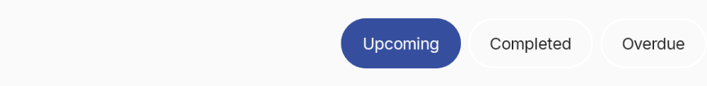
)Alignment — center
Chips use their intrinsic width and the row centres within the container.

DhPillTabs(
    selectedIndex = current,
    onTabSelected = { current = it },
    tabs = items,
    alignment = DhTabs.Alignment.Center
)
Alignment — end
Chips use their intrinsic width and the row hugs the trailing edge.

DhPillTabs(
selectedIndex = current,
onTabSelected = { current = it },
tabs = items,
alignment = DhTabs.Alignment.End
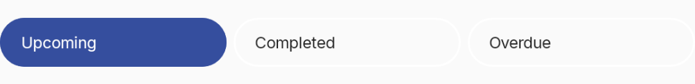
)Alignment — stretch
Each chip gets weight=1, sharing the container width equally. Useful when chips are a top-level filter.

DhPillTabs(
    selectedIndex = current,
    onTabSelected = { current = it },
    tabs = items,
    alignment = DhTabs.Alignment.Stretch
)
Scrollable overflow
When the row is wider than its container, alignment ≠ Stretch + scrollable=true gives a 90.dp-min horizontal scroller.

DhPillTabs(
selectedIndex = current,
onTabSelected = { current = it },
tabs = manyTabs,
alignment = DhTabs.Alignment.Start,
scrollable = true
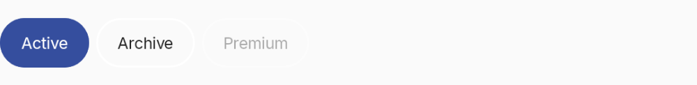
)Disabled chip
Tabs gated behind a permission or feature flag.

DhPillTabs(
    selectedIndex = current,
    onTabSelected = { current = it },
    tabs = listOf(
        DhTabs.Item("Active"),
        DhTabs.Item("Archive"),
        DhTabs.Item("Premium", enabled = false)
    )
)