DhText
Typography primitive. 12 style presets mapped to Material 3 roles + Davidhorn AppTextStyles. Prefer DhText over raw Text in new code.
Basic
Default Body style — 14sp.
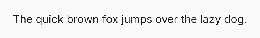

DhText("Hello")Headline
Page titles use HeadlineLarge.
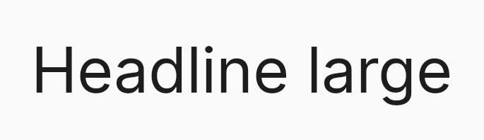

DhText(text = "Task Details", style = DhText.Style.HeadlineLarge)Body Bold
Use BodyBold for emphasis within body copy.
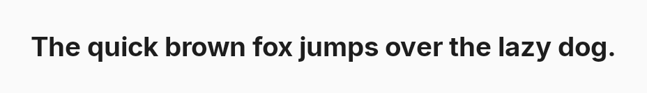

DhText("Required", style = DhText.Style.BodyBold)Truncate
maxLines + overflow = TextOverflow.Ellipsis.
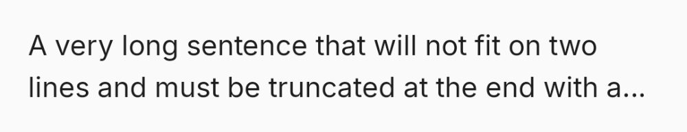

DhText(
text = longDescription,
maxLines = 2,
overflow = TextOverflow.Ellipsis
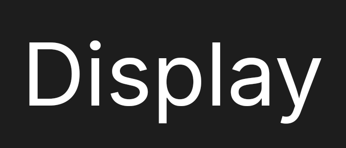
)Display sizes
DisplayLarge (96sp) / DisplayMedium (64sp) for hero moments.
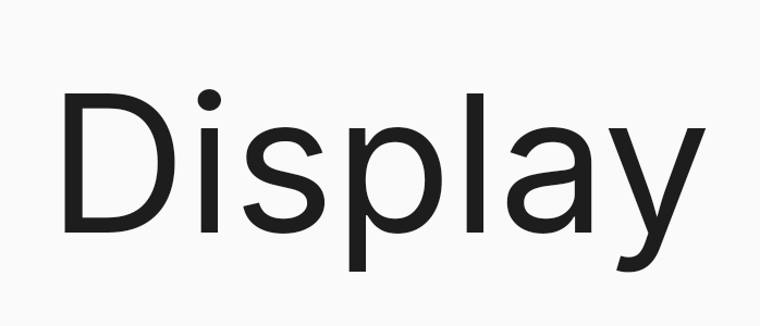
DhText("Display", style = DhText.Style.DisplayLarge)
DhText("Display", style = DhText.Style.DisplayMedium)