DhIcon
Renders a Lucide ImageVector with Justin sizing and a11y contract. Four named size presets (16/20/24/32 dp) plus Custom, decorative opt-out, tint defaults to LocalContentColor.current.
Pass any Lucide ImageVector to DhIcon — the artifact ships every glyph from the
Lucide pack. The curated DhIcons object is the recommended entry point for glyphs
used across the design system; reach into Lucide.* directly for the rest. The
full searchable catalog sits at the bottom.
Sizes
Four named presets pinned to AppSpacing tokens (16/20/24/32 dp) plus a Custom(Dp) escape hatch for one-offs like hero illustrations. Default is 24 dp.
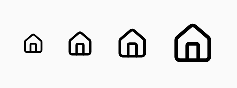
DhIcon(DhIcons.House, "Home", size = DhIconSize.Size16)
DhIcon(DhIcons.House, "Home", size = DhIconSize.Size20)
DhIcon(DhIcons.House, "Home", size = DhIconSize.Size24)
DhIcon(DhIcons.House, "Home", size = DhIconSize.Size32)
DhIcon(DhIcons.House, "Home", size = DhIconSize.Custom(48.dp))
Boxed
boxed = true centres the glyph in a rounded-square tonal container drawn from the effective colour (variant when set, else tint) — a 15% fill with a 1 dp border at 85%, matching DhAlert. Use for status badges.
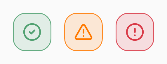
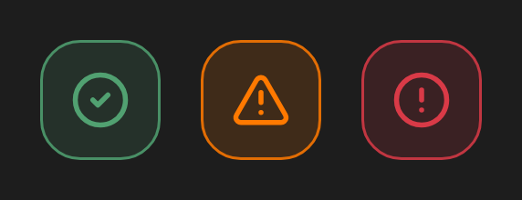
// Status badge — glyph in a tonal container drawn from the variant role colour.
DhIcon(
    DhIcons.CircleCheck,
    contentDescription = "Success",
    variant = DhIcon.Variant.Success,
    boxed = true,
)
Accessibility — labelled
Pass contentDescription when the icon is the sole conveyor of meaning (icon-only buttons, status indicators). Screen readers announce the label as the icon's name.
// Icon-only — contentDescription becomes the announced label.
IconButton(onClick = ::open) {
    DhIcon(DhIcons.Settings, contentDescription = "Settings")
}
Accessibility — decorative
Pass decorative = true when the surrounding text already conveys the meaning — the icon is removed from the a11y tree so screen readers don't double-announce. Missing contentDescription without decorative = true falls back to decorative behaviour (matching the Svelte side, which sets aria-hidden); pass an explicit string whenever the icon is the sole conveyor of meaning.
// Paired with text — keep the icon out of the a11y tree.
DhButton(
    text = "Save",
    startIcon = { DhIcon(DhIcons.Download, null, decorative = true) },
    onClick = ::save,
)
Tint — inherits LocalContentColor
The default tint reads from LocalContentColor.current, matching Compose's text-color inheritance and the Svelte side's currentColor semantics. Drop a coloured surface, and any DhIcon inside picks up the role colour without extra wiring.


// Inherits LocalContentColor.current (default — Compose's currentColor).
DhIcon(DhIcons.Bell, "Alerts")

// Explicit override for status / role glyphs.
DhIcon(
    icon = DhIcons.TriangleAlert,
    contentDescription = "Warning",
    tint = MaterialTheme.colorScheme.error,
)
Tint — explicit override
Pass an explicit tint when the icon's colour is independent of the surrounding text — e.g. status / role glyphs (error, success, warning).


DhIcon(
    icon = DhIcons.TriangleAlert,
    contentDescription = "Warning",
    tint = MaterialTheme.colorScheme.error,
)
DhIcons vs Lucide
DhIcons is the curated surface — recommended for anything the design system relies on, so a future glyph swap lives in one place. Lucide.* works directly for the rest, since the artifact re-exports the pack.
// Curated subset — recommended when the glyph exists in DhIcons.
DhIcon(DhIcons.Camera, "Take photo")

// Full Lucide vocabulary is available too via the api dependency.
DhIcon(Lucide.PartyPopper, "Celebrate")
Catalog
1960 iconsThe catalog is rendered live by the Svelte DhIcon from @davidhorn/justin — Compose can't run on the web, but both platforms ship the
same Lucide glyphs. Click an icon to copy the Kotlin DhIcon(...) snippet — curated glyphs emit DhIcons.<Name>,
the rest fall through to Lucide.<PascalCase>.
Showing 200 of 1960. Type to filter the full set — 1760 more matches when you search.