DhSwitch
Binary on/off toggle. Used bare or as a labelled row that fills the available width with the switch aligned right.
Bare switch
Only the switch — when the label lives elsewhere (table cell, custom layout).


var on by remember { mutableStateOf(false) }

DhSwitch(checked = on, onCheckedChange = { on = it })
Labelled row
Default settings-row pattern: label fills the available width, switch right-aligned.
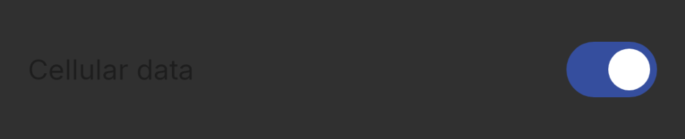

DhSwitch(
    checked = cellular,
    onCheckedChange = { cellular = it },
    label = "Cellular data"
)
Disabled
enabled = false fades both label and switch.
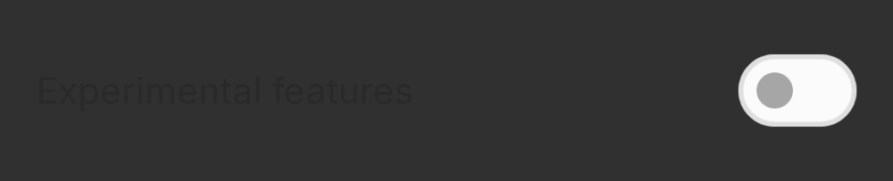
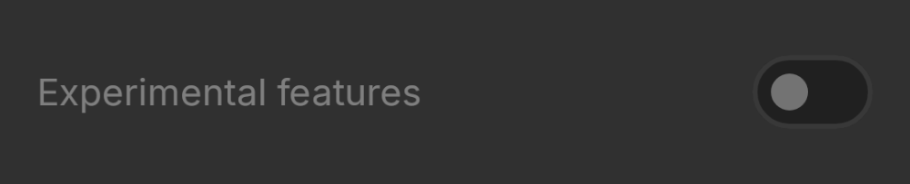
DhSwitch(
    checked = false,
    onCheckedChange = {},
    label = "Experimental features",
    enabled = false
)